Monday, February 28, 2011

How do I know when I'm done?


It takes a fresh eye…

Every artist (writer, musician, artisan) knows the feeling.  Unlike placing the last piece in a puzzle, or completing a crossword, the creator never knows precisely when her work is finished.  There is always room for one more brush stroke, one more adjective, one more bead.  How do we know when to quit?

Some art works have their own way of telling us that they are over-embellished or over-worked.  In watercolor painting and creating jewelry, less can be more.

I was thinking about these things today as I added beadwork to these bronze pendants that I had fired weeks ago.  Yesterday I selected the beads for each of them and spent hours trying different configurations for stringing.  Did the beads complement the stones and color in the pendants?  Were the various shapes, sizes and textures true to the style of the bronze work? 

Now notice the necklace in the center of the picture.  I strung simple amethyst beads with spacers in the middle of the strand and added larger, more colorful beads to one side.  Not sure if I liked the look, I left it lying on the workbench overnight.

This morning I looked at it with fresh eyes and saw something different: a different kind of symmetry.  The pendant is as irregular as the unfinished strand of beads, with its smooth and rough edges.  Somehow, hanging from this lop-sided strand, it seemed right.  There is something appealing about the asymmetry.  Something artistic…

Is it finished?  I’ll allow my eyes to refresh themselves again before I decide.

Thursday, February 24, 2011

Enamel

“Enamel? You mean you painted this with Nail polish? Bathroom paint? Resin?”
“No. I painted it with fire.”
There is no other way to explain the art of enameling to the uninitiated.

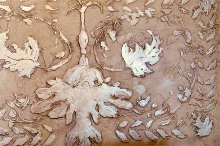
Of all the artistic techniques that I have learned over the years, enameling is the least appreciated, the most misunderstood by the public. So I am going to permit myself to post an explanation of my enamel work, starting at the beginning of my exciting venture into ‘fire painting.’

In the past I have always searched for new standards of intensity in color. I sought out ways to produce pieces generous in form, unique in geometry, appealing in texture. And I liked the idea of combining the skills that I had acquired working in metal clay and sheet metals with the painting that had sustained my career years ago.  For the artist who produces pieces one at a time, enamel offers infinite possibilities and, often, unexpected results. These were the challenges that attracted me to enameling.

The art evolved in early Greece sometime before 2000 BC, but after the beginning of the bronze age, when soldering with gold and silver became possible. In its earliest and simplest form, vitreous enamel is the fusion of glass granules, or powders, onto metal. Beyond that, it is not so simple.


You see, glass does not really “melt”; instead, it flows when it is heated. We say that glass “fits itself” to the metal when it is fired. The pigments and minerals that give each glass its distinctive color also impart specific physical properties to the glass. These characteristics are known as the coefficient of expansion – the softening point and rate of flow peculiar to each type and color of enamel. To complicate matters, different enamels may soften at the same temperature, but flow at different rates. And if that weren’t enough, the size of the glass granules, the type and thickness of the metal, and the firing time and temperature all interplay to introduce elements of unpredictability to the work. Each piece becomes a unique work of art. Success may come early to the beginner, but then we spend a lifetime learning the intricacies of enameling.

Enamels are available in different hardness. They can be lead-bearing or lead free. Some are transparent, others opaque, metallic, or even opalescent. They come in multiple size grains, or as paintable pastes. All of the above create a rich pallet of possibilities for the enamel artist, and also a mine field of potential disasters.

Left too long in the kiln, the glass will bubble, or burn. Not long enough and the enamel will look like an orange peel.  Metals tend to warp when they glow red hot. And the flowing glass will glue itself to the hanger or table that supports the piece inside the kiln if it is not removed at the precise moment. Firing is definitely a ‘hands on’ process.

Accordingly, each piece of enamel art becomes it’s own experiment. As in baking, the final results cannot be known until the cooking is finished. However, the process is forgiving in that the artist can build the piece in layers through multiple firings, adding, correcting, and modifying the work much as a painter would touch up a portrait. For me, this is the most exciting part of the process.


Often I create enamel art using the same technique that I used to paint in watercolor. I fire a white glass “canvas” first, then begin painting in negative, light to dark, layering the work in multiple firings.

Imagine the thrill each time you take a glowing piece out of the kiln and watch it reveal itself to you as it cools in seconds, and the colors, luster and texture come to life. This is truly “painting with fire.”

Tuesday, February 22, 2011

Beading: Tedium or Gratification?


Someone told me once that beading is to art as bowling is to sports: neither requires innate talent; the results improve with repetition, and they both can benefit from a bit of luck. Easy to say, when you’ve never strung a bead (or rolled a perfect game!)
4ZNNZCYRHHFH True, if one never goes beyond the patterns and techniques that are taught in the classes and books, beading can become tedious. The real enjoyment comes when we begin to view beadwork as art – painting with beads, as it were. The use of beads to create texture and shape in addition to color offers infinite possibilities.

After I had ‘paid my dues’ by learning the basic beading and weaving techniques, I began to look for ways to design beadwork for maximum visual impact. This required the addition of texture. I looked for unusual shapes and finishes that could be bound into tight, yet flexible, helical patterns to achieve an appealing symmetry. The goal was to create artistic pieces that are elegant enough for a wedding, but casual enough to pair with blue jeans.

Beading, like life, gardening, fitness (or bowling), becomes gratifying when we go beyond the tedium, always seeking ways to convert repetition into art.

Saturday, February 19, 2011

Mudworks


Sometimes Art evolves from the most mundane of projects.

The mudworks story began when my husband and I bought a home that was built in the 1960’s with the idea of remodeling and updating it ourselves after we retired. For months we dedicated our evenings to watching DIY programs on television. We attended the ‘Parade of Homes’ in several cities, created folders with pages torn out of the home & garden magazines, and scouted the home improvement centers for ideas. To mentor the project, we enlisted the services of my brother, Bobby, a building contractor, who graciously gave us 6 months of his life.
Then, as seen on TV, the three of us spent weeks tearing out walls, and stripping the floors and rooms of cabinets, fixtures and appliances. Finally we were ready to begin learning the basics of framing, tiling, and… mudding. We soon discovered that a near-infinite variety of wall textures could be produced with simple brushes, trowels or sponges. (Anything but popcorn ceilings!)

When we began texturing a special wall in the master bedroom that was designed for a fireplace and flat panel TV, the artistic possibilities began to take hold. We had used simple putty knives to give the wall a rustic Etruscan veneer because it seemed so Italian with its open arch window into the walk-in closet. But it deserved more. So I fetched my knives and brushes and began texture-mud-painting a floral design above the fireplace. A little gold paint, applied with traditional antiqueing technique, and voila! My first mud painting.

Later, I used the same technique to create a pair of “pop-out” mud artworks for my bathroom. This time I found inspiration in the illustrations of the Czech artist, Mucha, who was fond of leafy boarders and arches. The subject material for my ‘mud’ pop-outs came from our own garden – dried bunches of Stonecrop Sedum and Lamb’s ears blossoms.

Cost: a couple quarts of texture mud. Artistic effect: priceless!

Friday, February 18, 2011

Lamar


More Americans now live in foreign countries than have ever lived in small towns across our great land.

Actually, I just invented that statistic. But it seems like it could be true. Our urban cousins who come to visit us on the high plains of Southeastern Colorado often arrive with a sense of wonder at the absence of civilization here. For Europeans, it is an eye-popping experience to drive south from Denver for over 200 miles without passing through a single stoplight, or even seeing a stop sign along the way.

Three times each week we walk to the fitness center at the local Community College, about a mile from our home. We take a path that leads under a bridge, along Willow Creek, through a grove of cottonwood trees, passing by a sandstone monument marking the location where Zebulon Pike’s party camped in 1806 as he passed through this area.

A small herd of deer makes its home in this wooded area; they stand like statues as we pass by, within just a few feet of their fawns. Birders know this tiny oasis as a special place where over 300 species stop each year during their annual migration. So we are always keen to new chirps and feathers along the way.

We may not have a metropolitan museum, or a professional sports franchise in little Lamar, but how can one not be equally inspired by the cacophony of cattails, willows, thistles and wildlife that is just outside our door?

Wednesday, February 16, 2011

Year of the Honeysuckle


    Imagine what musicians and poets could do if only they were able to project color into their art!
     I’ve been thinking about this ever since I learned that Pantone, the global authority on color, had selected honeysuckle as the color of the year for 2011. But this new pink is not our Colorado garden-variety hedge honeysuckle. Pantone’s version of honeysuckle is achieved by cooling down the old hot pink into something more like raspberry.
     I certainly buy into the notion that changing colors can help us transition out of a cold winter, and even provide an uplifting in mood after a bitter recession. Colors have a way of instilling optimism, energy and spirit into our daily lives.
  In our homes most of us will begin by using it in the same way that we use garlic or sage when we cook - sparingly. Nobody is going to paint the living room honeysuckle (unless it is already bright blue). Even an entire sofa set might be a bit jarring in honeysuckle.
   All of which made me want to begin experimenting with this new color in my art jewelry. Enameling is the perfect venue for experimentation with new, daring color schemes.
   What do you think of my variation on honeysuckle?

Monday, February 14, 2011

Tree Shadows

Tree shadows are wasted on a summer lawn.
But after a few inches of fresh snow on a sunny winter morning, the shadows of a majestic tree mirror its architecture.  Like a kaleidoscope under the rising sun, the shadow reveals the sinews and tendons of last year’s growth, stripped of its summer foliage, on a flat frozen canvas.
Here on the plains of Eastern Colorado we rarely get to enjoy the softness of nature. Our rains and snows come in torrents, driven by winds that seem desperate to move things along. So when nature gives us a fleeting glimpse of her artistry, we pause for a moment and take notice, knowing that the next time we look it will be gone.
In the eye of an artist, these are the kinds of things worth capturing, to incorporate into a watercolor, or in the design of a bronze pendant. They are images seen only out of the corner of one’s eye, or blended into the background, as mere texture, contrast, or pattern.
But please don’t think that we under-appreciate the shadows of trees during our long, hot summers. In the summertime we just call it shade.

Saturday, February 12, 2011

Is symmetry the enemy of good taste?

The German philosopher Nietzsche’s vision of hell was to be condemned to live one’s life over and over and over again into eternity. Endless repetition. Suffocating symmetry.

Of course, these things we already knew. We intuitively avoid repetition and symmetry in the landscaping of our yards, and in the organization of our flower gardens. We arrange pictures on our walls purposefully avoiding parallel lines, or any juxtaposition that would suggest geometric designs. The tiles that we lay, and the individual pieces of wood that we select when laying a floor must give the appearance of randomness.

My biggest challenge as an artist has been to ‘loosen’ my style, to allow the chaotic asymmetry of nature into my painting, jewelry, and home decorating. Organization was my personal artistic demon. It would never let my hand stray too far from perfection, or allow my mind’s eye to see into the possibilities offered by abstraction. This freedom to innovate, I had to acquire through fierce discipline.

Several weeks ago I stumbled upon an artistic device - a system for doodling, really - that seems to unlock the gates that separate symmetry and her unseemly cousin, asymmetry, allowing them to co-mingle. Zentangles enables one to begin a work of art in total chaos and randomness, then to give it structure and unity.

Pictured is a sampling of my Zentangles designs, made while watching TV one evening. The ‘templates’ for each design were objects within my field of view and the television screen. (Perhaps you will recognize our cat, Rusty.)

Next challenge: incorporating a Zentangles design in a copper etching or bas relief in bronze. I’ll keep you posted on that!

Thursday, February 10, 2011

Quail

This morning a family of quail came into the back yard to visit. The blanket of snow on the open prairie just beyond our back fence surely made their foraging seem easier under the bird feeders hanging in the yard.

We never see just one. They are the most social of wild birds, marching around the yard like a squad of little soldiers in single file.

Among my best-selling enamel pieces are birds, butterflies, and even a little pig pendant. I must try to capture the distinctive shape and colors of these quail with their cotton-top crowns.

Wednesday, February 9, 2011

It's out there!

The blog came to life at 6:38 Monday afternoon. I took it “live” without the benefit of a profile, links, or even much of a statement of purpose. I suppose all blogs come to life in a similar way.

I chose the bronze necklace, a piece I named “Nestling”, to lead into the blog because it seems to sum up where I am with my bronze clay work now.  So I am going to allow myself a few words of explanation about working in bronze.

I love working with bronze because it has been the quintessential material for sculpture, jewelry and artworks for over 55 centuries.  Bronze is stronger than iron.  It resists corrosion, remains ductile, and jingles with a nice resonant ‘ping’.  All of which makes bronze ideal for artwear that is stylish, but unassuming.  Did you just read, “…and it’s a lot less expensive to work with than silver?” Glad I didn’t have to spell that out.

 The process I use begins with Bronzclay.  The “Nestling” was formed from three separate moldings of Elm tree bark that attach behind a hand-rolled bezel, nestling a large aqua stone. Bronze develops its patina during the firing process, and over time each piece acquires its own unique ‘living patina’, often exhibiting warm hues and azure highlights where it is most often touched.

Since each piece that I design is one-of-a-kind, the intention is for it to become an heirloom possession.  I’d love to hear from other bronze enthusiasts.

Monday, February 7, 2011

... beauty for its own sake

The jewelry that I design seeks to become art. It seeks beauty for its own sake. Because every piece that I create is one-of-a-kind, each piece must represent its own best effort. It must be unique and un-revisable - and natural. Like life itself.

Symmetry and perfection play only supporting roles in these efforts. More important are the values of balance, contradiction, and understatement. For it is the art of nature not to conform, or to imitate, but to be original, authentic, and genuine.

Surely I am not alone in this endeavor! The world must be filled with others who recognize that we create art for the same reasons that we fall in love, and have children, and keep pets, and grow flowers. The artworks that we are compelled to create provide substance, purpose, and meaning to our lives.

And so… this blog, which I begin for many of those same reasons. It is not my purpose to merely create a record of my own endeavors, but also to seek out others who may share my passion for art in all its forms. Surely we will have much to talk about.
Related Posts Plugin for WordPress, Blogger...